Section Navigation

Introduction
Students will learn techniques for creating tutorial systems for their games. Tutorial design, though seemingly a narrow practice, covers many fundamental skills of game and product design used throughout the experience of a product. These skills easily translate to UX, UI and level/game design in all parts of game or product.
Let’s say you’ve come up with a cool idea for a game and have some of the levels or areas designed and have even shown it to your friends. Now you want to take it to the next level, from a prototype to a game. Along with thinking about progression and content, you need to come up with a way to teach new players how to play your game. How do you do that without making it boring? Can you teach them while they’re playing so they don’t even know there is a tutorial? This lesson gives some tips and advice to think about when making your game.
A good game tutorial is one that is seamless within the game so that players don’t even realize they’re following a tutorial. In product design, a good “tutorial” is one where users can open up a product and figure out how it works without having to read a manual.
Learning Goals
Students will learn some basic human psychology that is involved in the UX in game and product design. This lesson will cover:
- Schemas
- Using visuals for guiding players to an outcome
- Pacing new concepts to avoid cognitive load
- Various cognitive biases
- Designing game challenges around teaching concepts
- User and play testing
Vocabulary
Cognitive Bias:
“Systematic patterns of deviation from norm or rationality in judgment.” In other words: humans have evolved to process information quickly, sometimes at the sake of accuracy, which can lead us to make unusual choices or come to decisions without full awareness.
Norman Doors is a term coined by Don Norman, a UX designer who suggested that doors should be easy for people to understand how to use, yet, we encounter many poorly designed doors! Poorly designed doors are nick-named Norman Doors.
For example, answer the following math question: A bat and a ball cost $1.10. The bat costs 1 dollar more than the ball. How much does the ball cost?
Got your answer?
It’s 5 cents.
It’s a seemingly simple math question but most people incorrectly answer 10 cents. That’s because when we read the question, our brain processes the information quickly, and we focus on the two amounts: 1 dollar and 10 cents. Then when asked about the difference, our brains jump to subtracting 1 dollar and finding 10 cents remaining. That seems right so we answer with that. It takes energy to sit down and think the question through, and most of the time our brains prefer to process info quickly, and don’t even realize we’ve made an error.
If you had read this:
A bat and a ball cost $1.10. The bat costs 1 dollar more than the ball. How much does the ball cost?
You probably had a greater chance of getting the problem correct. Making something physically harder to read slows your mind down enough that you are more likely process the question rather than jump to an answer that seems right. And it’s not about motivation, you were quick because your brain is naturally quick. Cognitive bias is a subconscious process beyond your control. We may think we control it, but we don’t.
Cognitive Load:
Refers to the effort used in a person’s working memory (which is different from short-term memory). Working memory is where you think about the problem at hand, along with all the other pressing things on your mind at the time.
When a person is learning new concepts or ideas, or processing a lot of information at once, they need a lot of memory to learn, and working memory is extremely limited. It can also make us feel strained or challenged. This feeling of challenge can be exciting and stimulating during games, but to be in this state for a prolonged period can lead us to feeling tired and helpless.
For instance, work this problem in your head:
56
42
+___
Now, try this one in your head:
275295286
836285737
+_________
In the second example, the “problem” is the same as the first. The skills needed are the same. But for most of us, the second sum asks for more than our brains can handle. Our eyes gloss over the numbers and we probably don’t even want to attempt the problem in the first place.
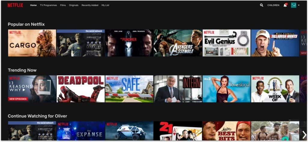
Choice Paralysis:
Related to Cognitive Load, this is when a user is presented with so many choices that it is hard to make a decision. Do you ever find yourself swiping through Netflix titles, yet unable to select one?
Discoverability:
Where users discover what operations the product or game can do on their own.
Feedback:
Receiving some kind of messaging reinforcing whether an action was performed. Such as a sound, vibration, or colour change.
Flow:
Also known as being in “the zone”, this is the mental state in which a person is fully immersed with a feeling of energized focus, full involvement, and enjoyment in the process of the activity. In games, flow is when players are fully immersed and feel challenged but not frustrated.
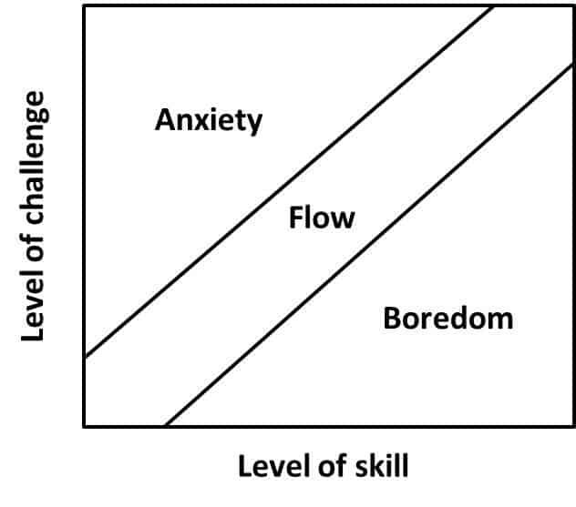
Here is a chart that shows flow used in game design. When a challenge is too hard for players, they can feel stressed, anxious or strained. When a challenge isn’t hard enough, players can feel bored. Flow is the perfect balance of a challenge that is engaging and fun, but not too hard to cause strain.
Disfluency:
When the state of “flow” is broken, usually as an outcome of something unexpected happening.
Conceptual Disfluency:
When a schema or expected outcome doesn’t happen. It creates “attentional blink” or confusion when a stimulus goes against what is mentally anticipated or expected. For example, when the colours or positions of the OK and Cancel buttons are swapped in the UI, which leads players to accidentally hit the wrong button.
This is another example: It causes users to stop and think because the colors are swapped:
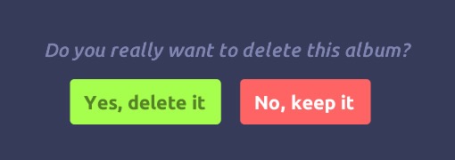
Delete is typically red, and keep is typically green. This mismatch causes a “second take” for users.
Game Tutorial:
A section of the game that is designed to teach players how to play the game.
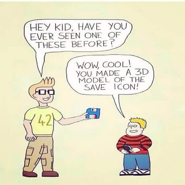
Schemas:
A pattern of thought or behavior that organizes categories of information and the relationships among them. For example, a floppy disk icon that means Save… or a trash can that means Delete.
Priming:
A technique where exposure to one stimulus influences a response to a subsequent stimulus, without conscious guidance or intention. For example, the word NURSE is recognized more quickly following the word DOCTOR than following the word BREAD.
Another example of priming are the following pictures:

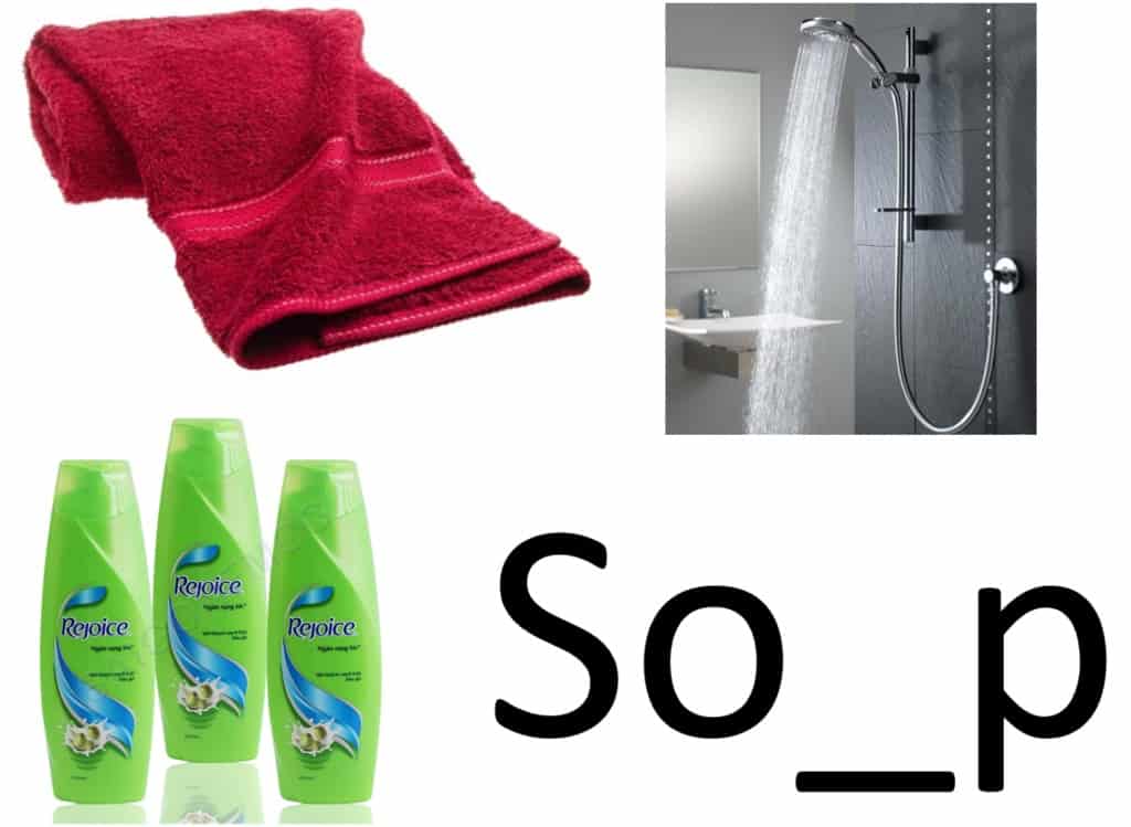
If asked to fill in the missing letter, viewers would more likely answer “u” in the first image to make the word Soup… and “a” in the second, to make the word Soap.
Guiding Questions
- What is the purpose of a game tutorial? It is more than simply teaching players how to play a game. A tutorial should engage and excite players about the game, encouraging them to play. A tutorial should not make a game seem hard, frustrating, or boring. But it also shouldn’t treat the player as if they don’t know anything. A good tutorial should Teach, Comfort, Engage, and Respect.
- What does a game tutorial look like? It should blend in to the game or product seamlessly so that users or players don’t even realize it’s there. Which isn’t the same thing as not having a tutorial. It means that the game itself is the tutorial
Curriculum Links
Through this module students will learn about Psychology and Systems Thinking concepts, and engage their Critical Thinking skills in the process, which can be applied to any subject or curriculum.
Materials
None needed, just observation of doors, and household products found around the home or classroom.
Non-Computer Activity
Norman Doors
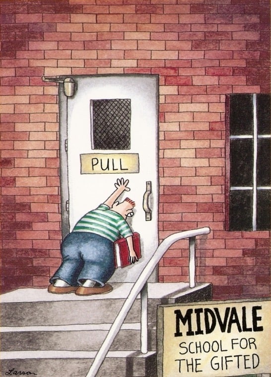
Unlike what the comic makes a joke of, when a door is confusing to figure out, it is generally the failure of the designer who made the door, not the person trying to use the door.
Look at the door handles below:

They each suggest a different action. What is the action you would expect to take to open the door handle on the right? How about on the left?
What about this one?

Can you think of a time that you walked up to a door only to find that it needed pulling instead of pushing?
Look at the picture below. This is a classic example of a Norman Door.

The handle on the door communicates one action: Push, yet the label says the opposite: Pull. Can you think of a better handle to use that might make it easier for people to know what action to take to open the door? Here is a great intro video to Norman Doors.
Door handles are like a tutorial for using doors. In fact, a lot of UX design can be thought of as tutorial systems. Product designers need a way to teach people how to interact with their products. Successful designers utilize concepts people already know to help them understand how to interact with the product. Such as which door handle shape to use. This may conflict with a designer’s wish for aesthetics (or the look and feel of the whole product). Keeping something “slick” or “pretty” needs to be weighed against user experience.
In this picture, the metal handles were chosen for their simple and sleek design, yet they might add confusion to people trying to use them.
Look at other types of everyday objects. Can you tell by looking at them what they do. How do you pick them up, carry them, use them?
Using colors and visuals
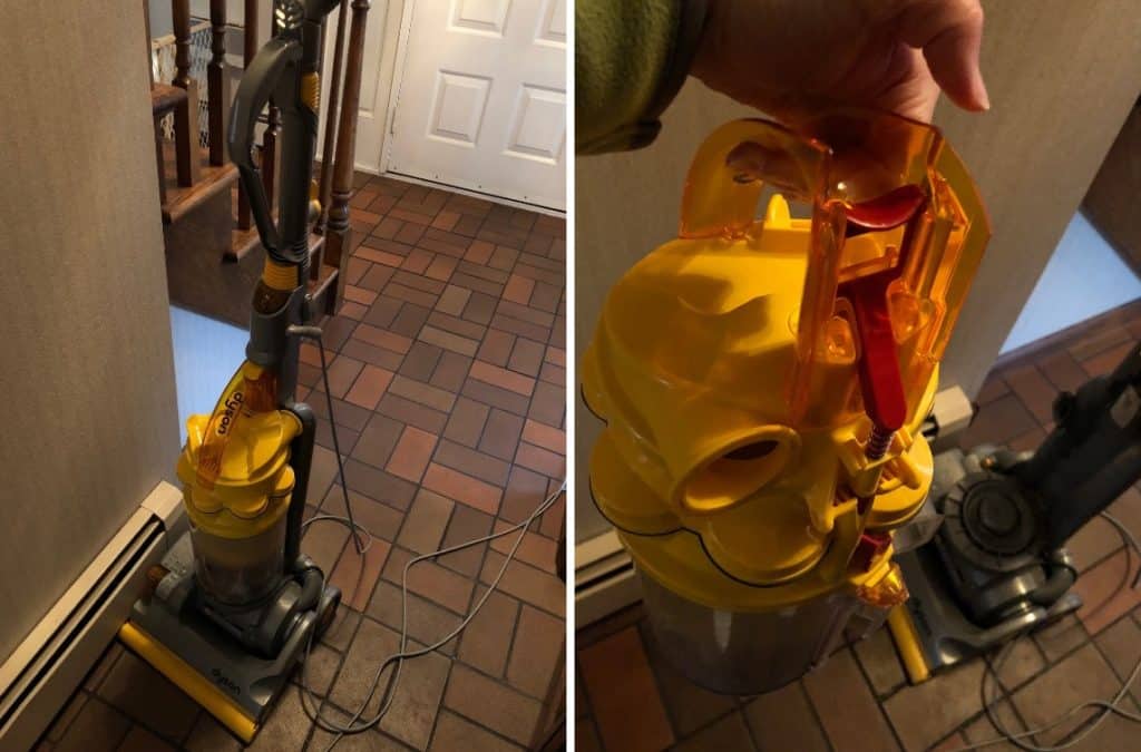
Using colors and visuals can complement the UX of a product as well. Here are two items that use color for teaching how to interact with the product.
For the stroller, users can quickly look at it and know that the blue parts are points of interaction. Each blue part indicates something that can be changed.
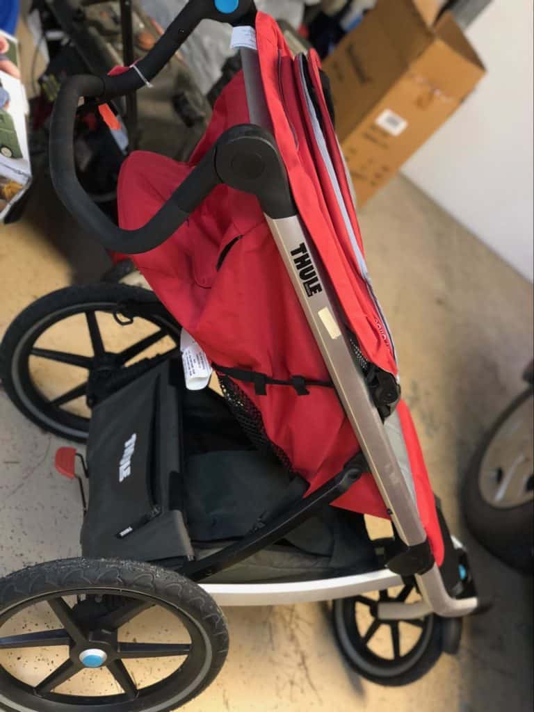
The blue parts are easily seen..
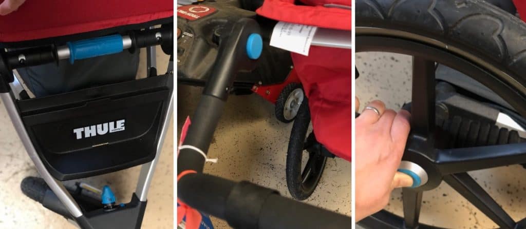
Each one does something simple that takes a short time to figure out. Users can easily discover how to fold up the stroller, remove the wheels, adjust the handle bar or lock the front wheel easily without needing to read any instructions.
It is the same with this vacuum. The yellow parts are the interactive components with the only difference being the red part that suggests a warning to be careful (it empties the canister). Users don’t need to read a manual to figure this out, they understand to look for the coloured areas and play with them until they figure out how to do the adjustments.
This is successful because they are bright, consistent, and the interactions are fairly limited so after playing with them for a short time, users easily discover what needs to be done. If the components were different colors, it may cause confusion. If they had multiple purposes or a wide range of movements, users might get frustrated and need to refer to the manual, which would be a failing of the tutorial.
There are two things that go into a good tutorial design:
Discoverability: Users discover what operations the product or game can do on their own. In the stroller and vacuum examples, this is done with consistent bright colored parts which signal: “hey, play with this thing”. Each part is paired with only one action: adjust handlebar, remove wheel, etc. Each part had a limited set of actions. Button could be pressed (but not turned or pulled), locks should be twisted (but not pushed or slid).
Feedback: Receiving some kind of messaging reinforcing whether an action performed did the thing users intended. A click, spring, lock, beep, or glow are all examples of feedback that give the user confirmation their action took place. This is necessary so that users understand “did what I just try work?” If no feedback is provided, users may think their motion is wrong or that something is broken
Do you have similar products in your home? Are they easy or difficult to operate without reading the manual? If easy, what makes it easy to understand? If it is confusing, what makes it hard to understand and can you come up with another design that makes it easier?
Computer Activity
Compare examples of tutorials in games
Like a good door that you simply pass through without thinking about it, a good game tutorial is one where you don’t even know it is there.
Example of a challenging tutorial:
If you have the tutorial in it’s own section, accessed via a button on the home screen, that looks about as fun as reading the credits in a movie. Most players are unlikely to click on it and therefore will never read or play your tutorial.
Other common types of tutorials are instructional screens that pop up before the game starts. This is not an ideal approach for a few reasons:
- Most people don’t read the popups, skipping them until they get to the game.
- It loads all the info up front and out of context. Players have no idea why they need to know the information if they haven’t even played the game yet.
- By the time players get to the game, they’ve likely not retained any info, even if they read the tutorial.
Another common tutorial system guides players “by the hand” through a practice or introductory level. Typically there are large arrows pointing to actions players need to take. This is not the best way to share a tutorial because while it tells players what to click on or press or move to, players usually have no idea why they are doing these things. They’re simply following the arrows to the end of the tutorial and as a result, they don’t learn what they are supposed to do. Using arrows to make players aware of a new tool can be good, but the problem with this type of tutorial is the number of arrows in quick succession. Players don’t get to play with or really understand what they just did.
Example of a tutorial that is simple and easy to follow
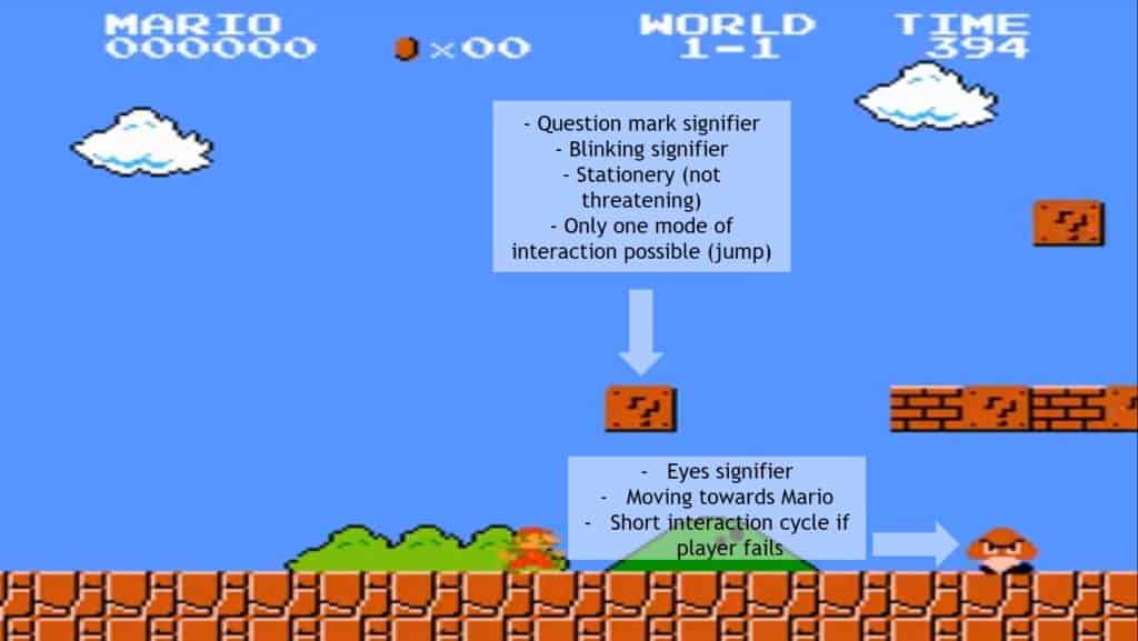
Super Mario Bros: Super Mario Bros has a great tutorial in the first world which has been broken down by a few people but one of the best is Abhishek Iyer’s Medium article.
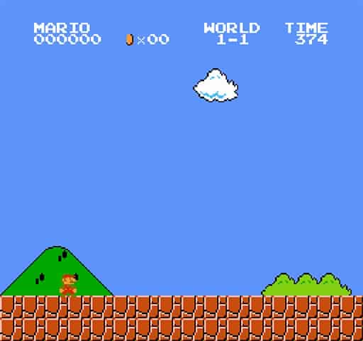
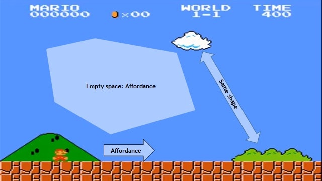
Here is the first screen of the game. It may not look as though any information is being imparted, but each detail is carefully laid out to teach something to the player. Here, Mario begin on the left with a lot of space above and in front of him. Throughout the game, the camera position places Mario in the center of the screen, except the first scene of the game. All of this empty space around him indicates to the player that Mario should go forward. Also, because there are no threats or distractions, it shows that it’s a safe space to figure out how to move
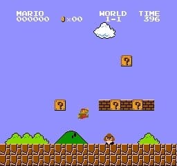
In this screen, the game is teaching the player a few different things: “? boxes” and “Goombas”.
? Boxes: Here the player encounters some stationary, glowing ? boxes. The question mark icon seems to indicate that they are interactive. Their position off the ground indicates that the player will need to jump to touch them. There is no need for any text to explain what to do. The careful positioning and sequencing of these new items provides all the instructions the player needs, in a way that the player discovers their function on their own. When the player jumps at a block, a coin is revealed, so the player learns that ? boxes allow them to get coins.
Goombas: The Goomba wears an angry expression and moves towards Mario, indicating a threat. If the eyes were friendly or expressed sadness, it would communicate something entirely different and suggest a different action. But because of the Goomba’s threatening appearance, it seems like something to avoid. The player can jump over it and run away from it, or discovers that jumping on top of it kills it. If the player runs into the Goomba, they learn that they lose a life, but get to try again, now knowing to avoid Goombas.
Plants Vs Zombies:
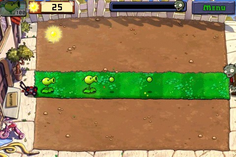
Plants vs Zombies features a great tutorial sprinkled throughout the first several levels. Here is a screen that teaches players about the basics of the game. As with the Mario example, the game limits the player so that they are focused on learning and observing only the key rules of the game. In this level, the game board is limited to a single row. Players have only one plant to choose, the peashooter, and they can see that a Zombie is entering the house. Players may not understand what a peashooter does the first time, but by limiting the game space to one row, the player learns through trial and error where to plant the peashooter so they can advance. If they plant a peashooter on the right, they fail, and the only thing they can do differently is change the position of where they plant the peashooter. They succeed when they plant the peashooter on the left.
Components that make good tutorials:
Break the learning goals into puzzles or situations that fit your game design. Help the players build a mental model of your game system without them realizing they are playing a tutorial.
Think about what is the most important thing to teach a player first and then only focus on that learning goal. Build in space like the first screen in Mario so that a player feels safe playing around with this newly learned thing.
Teach the player one concept at a time (in the context of the game). Let them play with their new toys first before giving them more toys.
Space out your learning goals and features. Players don’t need to know all the cool stuff in your game right away. Save new features, weapons, modes, enemies or challenges for later in the game after your player has a good understanding of the basics.
Get out of the player’s way (but have some structure that allows them to get to the point).
Avoid stopping the player in the middle of the game to teach them something new. Let them figure out a new challenge by making the goal clear.
Leverage what people already know.
Schemas
Schemas are an organized mental representation of stimuli to help relate concepts to one another. Schemas can be models of info we have for categorizing things. For example: a schema of features that make up a cat are: furry, has tail, meows, has whiskers, likes mice, etc.
Schemas can also be abstract symbols that represent different concepts or ideas. There are many of these in games.
Can you think of some universal schemas in video games?
(Heart = health, Hourglass = time, Shield = protection/defense, Plus icon = health pack or gain, Sword = attack, Trophy = achievements.)
Using familiar iconography is a good way to quickly communicate elements or concepts in your games without the need for explanation.
Spiky angry things express harm, soft, cute things convey something safe or benign.
Schemas are learned from past experiences.
For example:
Start or New Game is at the top of most game menus, while Quit or Exit Game is at the bottom. It would be a conceptual disfluency (a fancy way of saying something that seems weird or unexpected) if Quit was at the top and the New Game button was at the bottom. Players might accidentally quit the game when they wanted to start a new game.
Schemas are a great way to make your games easier to learn because they leverage information that players already know.
Here are some schemas used in Plants Vs Zombies:
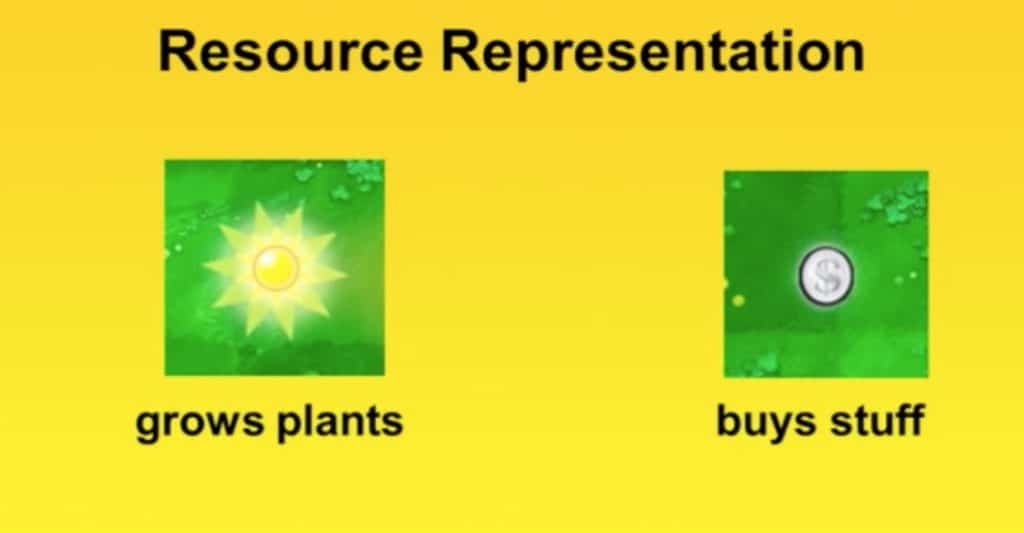
Sun grows plants, money buys stuff. This sounds simple but coming up with another system like using electricity instead of sun would make it harder for players to understand. People typically know that sunlight makes plants grow so using the sun icon for energy uses a schema that helps players understand the function of something without requiring a lengthy explanation.
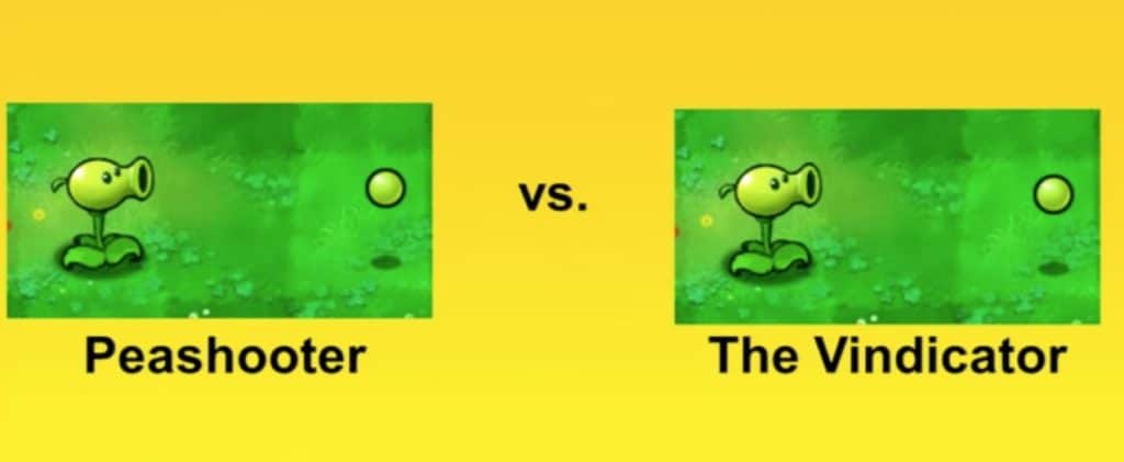
Labels or titles can also help. The name peashooter indicates its function (a plant that shoots peas at the enemies, Zombies) which helps players understand what it does. The game uses plants because plants don’t move and Plants vs Zombies is a tower defense game in which the towers stay in place while the enemies move.
Schemas Bonus Activity
Schemas can change depending on cultural context. Schemas common in the US and Canada might not translate to users in China or Japan. Are there schemas you can think of that are unique to your community or country? How would you use these schemas in your games or your designs?
Have the players Do, not Read.
Avoid text wherever possible, but if you need it use it, do so early in the game, and keep it “caveman” short. Use as few words as possible, break up phrases, allowing no more than eight to ten words on the screen at a time.
Use Priming techniques
Priming is when you see something that frames your thinking. For example, if you were shown a picture of bread and then asked to fill in the missing letter in SO_P, you’d be more likely to choose a U to spell soup, than an A to spell soap. Games make use of priming.
A good example of priming is in Zelda Breath of the Wild. In the Yiga Clan hideout after a player has defeated the Yiga Clan, there is a room full of buried treasure. To get at treasure, the player has learned previously to use the magnet tool. And behind one of the treasures is a hidden wall which can only be opened with… the magnet tool! Here the priming is using the player’s experience gathering treasure to ensure that the player has the correct tool in use.
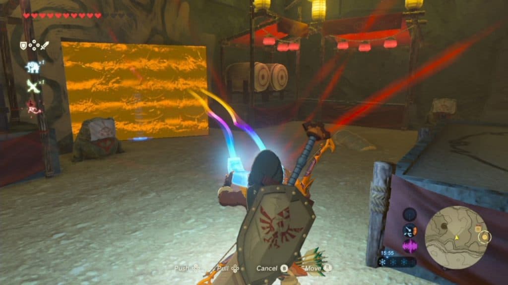
Screen of hidden door being used with the magnet tool (with buried treasure off to the right of the player).
Once you feel you have a good tutorial, test it with users, and know there will be revisions and refinements.
When making a tutorial or a game, it is important to get feedback from others so you can find out if there are any gaps in your design. There are always problems that arise when making games and tutorials. Sometimes you think you’ve created a good puzzle for teaching, but when you test it, you find that it makes things more confusing for players. Here are some suggestions for user testing:
- Have as many people play your game (gamers, non gamers, etc).
- Watch people play and don’t interrupt to show them how to do something; observe how they go about figuring it out.
- If a number of people fail at the same point, it usually indicates that something isn’t clear, not that they are “bad” players.
- When you test again, have people who have already played your game AND people who have never played your game try it out.
Conclusion
Take a game tutorial and find two ways to improve it
This can be any game, a game you are working on, or a game you like to play. If it is a game you are working on, think about what you want to teach and explain how you are doing this using the first few levels.
If it is a game you like to play, think about the beginning of the game. What did the game have you do to learn how to play?
Cognitive load and squint testing activity
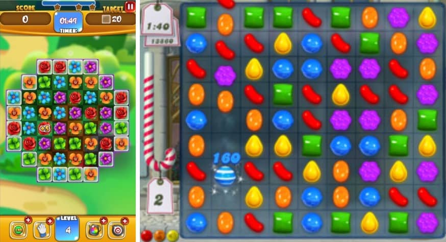
Here are two very similar games. They are both matching games where the goal is to clear the board by combining three or more of the same adjacent icons. They may appear similar, but one of these games takes more brain power to play. Can you spot which one?
If you chose the flower one on the left, you’d be correct. Here visual complexity isn’t a good thing. While the flowers are all different, they are so detailed that they become a bit more challenging to distinguish. Compared to the candy shapes on the right which have simple colors, clearly different shapes, and are very easy to distinguish. Even a subtle difference like this can make a game feel more tiring to play, even if players don’t understand why.
Squint testing is used in design, art, and UI to ensure that elements stand out and that the most important information is easily visible. Squinting or blurring your eyes allows you to see what stands out.
Resources
Websites / YouTube Videos
- How I Got My Mom To Play Plants vs Zombies
- Teaching by design: tips for good tutorial design
- How To Make Great Game Tutorials
- Julia Keren-Detar’s talk about Tutorial Design in Mushroom 11
- The Mario Medium article linked above
Books
Podcasts
Social Media Resources
- Allen Turner (Twitter: @CouncilOfFools) is a game designer and professor at DePaul University in Chicago.
- Beth LaPensée (Twitter: @odaminowin) is a game designer and professor at Michigan State University.
- Jay Odjick (Twitter@leah-jackettJayOdjick) is an artist who makes comic books, TV series and other great art.
- Renee Nejo (Twitter: @Nay_HO) is a 3D artist, game designer and teacher.
- Jonnie Jae (Twitter: @johnniejae) founder of @tribecalledgeek, a site focused on Indigenous and geek culture.
You might also like

Introduction To Social Media Safety
 Middle – Grade 8
Social media is fun and a great way to connect with people from across the world, but it can also be dangerous. Students will learn how to keep themselves safe while using social media.

Using Digital Tech To Explore The World Around You
 January 30, 2020
Pinnguaq proudly creates and uses digital technology is to teach, preserve and shape public opinion about environmental exploration using digital tech.

Building Healthy Relationships Online
Grade 9 – Grade 12
The internet can be a complicated and scary space. Learn how to build healthy relationships with others while you navigate the web!
