Artist Ian MacLean Explains how he designed the cover for the first issue of Root & STEM
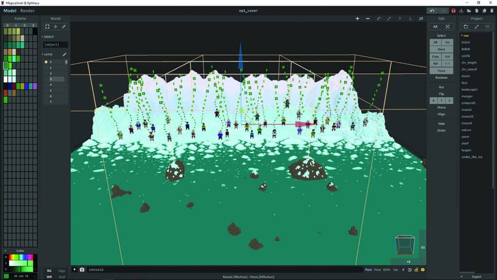
The cover for this issue of Root & STEM was developed using free, open-source software. The majority of the development was executed in MagicaVoxel, a voxel editor that allows the user to create images with volumetric pixels.
The process is similar to creating pixel art, but in three dimensions and with additional tools for applying different materials and effects to the scene.
Some additional post-processing was done in Krita, a program with tools similar to those commonly found in Adobe Photoshop, but with more of a focus on drawing and painting.
To start the process, I sketched out a series of thumbnails—small rough compositions—to connect the cover image to the main themes of the issue: climate change and technological solutions. For an image, I decided to focus on receding sea ice in the Arctic.
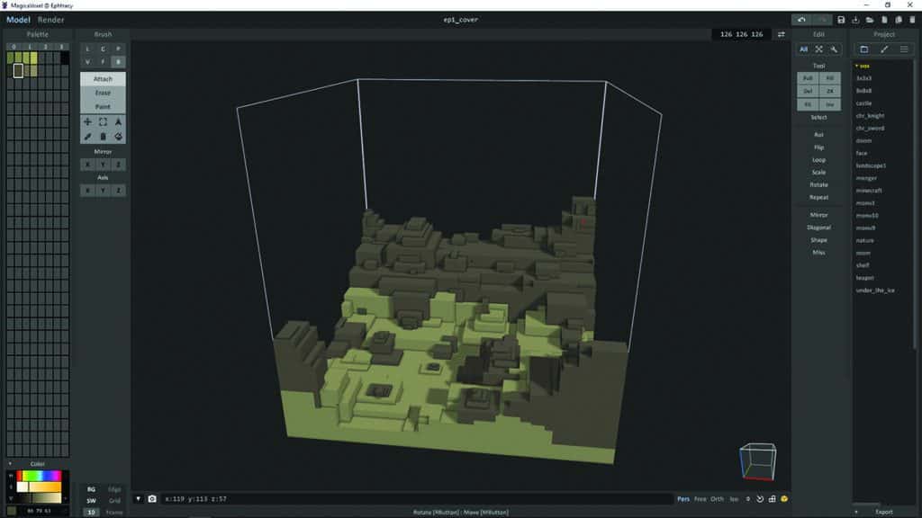
I began with a single scene, defining some colours for the palette and roughly blocking in the seafloor and bedrock. At this point I used the “box” brush to click and drag out large clusters of voxels. I switched to the “voxel” brush to sculpt and detail the area, and began to drop in some human characters.
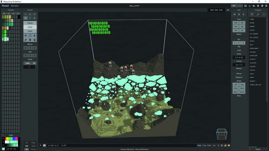
Because the brush requires a surface to attach to, and I wanted to include some floating blocks of ice, I used the upper surface of the scene (essentially the ceiling) to draw out the ice forms, then selected them and dragged the whole area down to the level of the sea surface.
Once I had dragged it into place with a box brush, the material type was changed to glass with varying opacity, to give the appearance of water and ice.
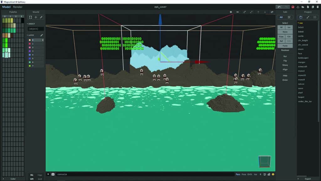
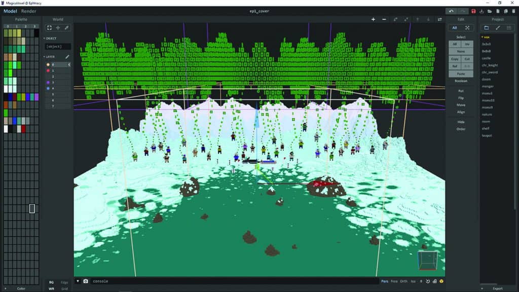
It became clear at this stage that the complete image would require more than a single scene, so I copied the base scene and mirrored it to the sides, extended the sea forward, and placed a series of scenes in the background, with “flats” of mountains reducing in contrast.
In total, the image contains nine scenes combined to create the sea, people, land and sky, and six additional scenes to handle the information cloud that hovers above, fed by the data streams from smartphone and tablet devices in the characters’ hands.
I wanted the data cloud to resemble an aurora, so I varied the edges and depth, and duplicated the entire thing so I could apply a couple of different materials. I expanded the area depicting sea ice to help the composition, and added a snowmobile with a SmartICE monitor suite and some data buoys to tie into the feature article.
Once it was complete, I rendered the scene to a series of 2D image files. To add some effects to the data cloud, I rendered the scene three ways—with the cloud removed, with the background removed, and in its entirety.
To illustrate the light emitted by the cloud, I arranged those images in Krita, adjusted levels and colours, and applied some blur effects. The images were merged, final adjustments were made, and the cover was prepped for publishing.
Both free to use, MagicaVoxel and Krita prove that you can create effective, professional artwork without paying for professional tools.
To learn more about Krita, watch Ian’s video series about comic creation using Krita.
