
Section Navigation

Introduction
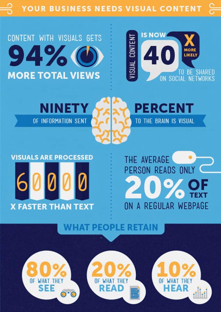
Infographics present information in a concise and easy to view manner. Students will create an infographic on a broad topic of the teacher’s choosing. Students may choose a more specific topic that fits within the broad topic.
Learning Goals
By the end of this module students will be comfortable creating infographics using Piktochart. They will be able to think about their intended audience, and identify what key points are most relevant to that demographic.
Vocabulary
Infographic - a chart or diagram that represents information or data in a concise visual manner.
Block - a section of the infographic. Sections can be added or removed as needed.
Guiding Questions
- What is an infographic?
- What type of information is best-suited for an infographic?
Curriculum Links
The infographic can be done on a variety of topics allowing it to connect to any curriculum. For example, students could create an infographic on World War II alliances, the plot in their novel study, equations for volume, the difference between animal and plant cells and much more!
Materials
- Print Ads (magazines, newspapers, etc)
- Canva account – Register for Canva
Non-Computer Activity
When making an infographic it is important to consider your audience. Let’s practice thinking of intended audiences using print ads. Examine the print ads and identify the intended audience. Ask the students what helped them determine the target audience? Images? Words? Slogans? How could the ads be adjusted to make them targeted to a different audience?
For example a vitamin ad targets adults who want to stay fit and healthy. The imagery of a cyclist might be used to make people think about being fit and active. The text may talk about being “on top of your game”, which appeals to an activity- or sport-oriented demographic. If the audience was switched to teens, an extreme sport might be more relevant, as well as a more vivid colour scheme. For seniors, an activity like water aerobics or walking might be most relevant to them.
Computer Activity
For this activity students will create an infographic based on the topic given by the teacher. To create an effective infographic, a few things need to be considered:
- Purpose: What is the purpose of the infographic? What information does it need to convey?
- Audience: Who is the target demographic for this information? What is relevant to them? What do they need to know? What do they want to know? Make sure the data relates back to the topic in a way that is useful for the audience.
- Research: After thinking about the audience, you may need to rethink the purpose in more detail. Investigate your topic gathering any information you need, always keeping your purpose and the audience in mind. Check all facts for accuracy. Explore the ways your data could be shown visually.
- Outline/Draft: Create a rough sketch of your idea and the points you want to cover. Keep assessing for the relevance to your audience and see if there are any gaps in information where you need more research.
- Assets: Gather any images or icons you will need. Include any sources for your data to show credibility and give credit for others’ research.
- Data: Be sure to include data or information on your topic that can be represented in a visual manner.
There is more that can be considered when creating an infographic, but this is a good starting point. Visme has a blog post on How to Make an Infographic.
Examine a few infographics together so students have a better idea of what an infographic is. What do you like about the infographics? What do you notice first? What changes would you make?

Canva Instructions
- Students will need a Canva account. After they have created their account, search for infographic templates in the search bar. Select a free template to use for your infographic.

- Start by changing the title and adding your name. Text can be edited by double clicking on it. The menu across the top will change based on the type of element you are editing.

- The font can be changed using the drop down menu on the left. The size can also be adjusted using the numbered drop down menu.
- The colour can be changed by clicking on the “A” with the colour bar below it. Clicking the “B” will bold your text and the “I” will make it italics. The alignment of the text can also be changed by clicking on the horizontal line icon.
- Other elements can be deleted by selecting the element and clicking the garbage pail icon.

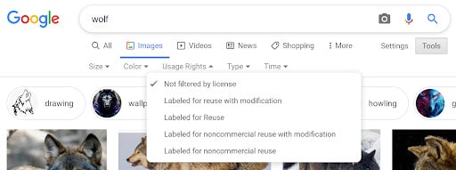
- Students can add images to their infographic. These can be gathered through Google and saved to their desktop, by right clicking on the image and clicking save. Creative Commons is the best place to find images that you can legally use.
- To search google for free use images select the “tools” button under the search bar. Next click the “Usage Rights” drop down menu and select “Labeled for Reuse”
- Students can also create their own images to use for their comic. Pinnguaq has a series of lessons on Pixel Art and a lesson on Inkscape.
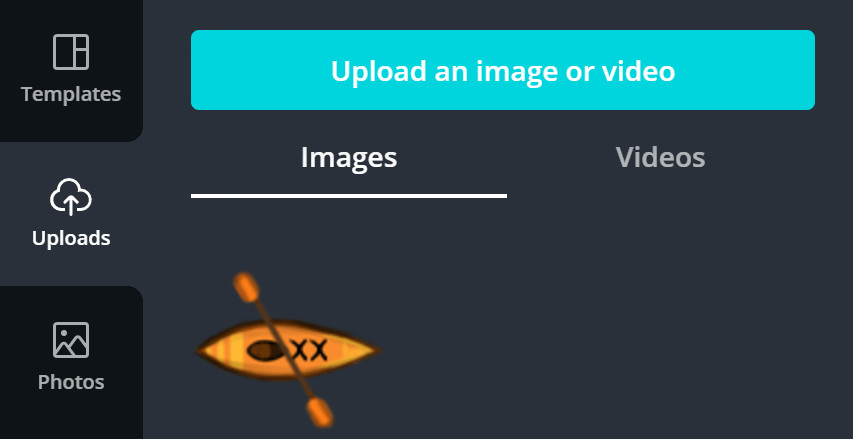
- On the left-hand side of Canva there is an upload button for adding images, backgrounds, text, and also a gallery of free elements.
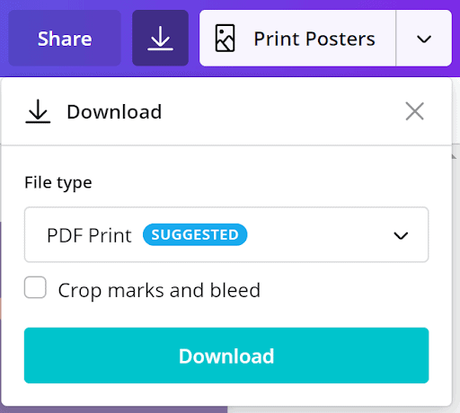
- Once students are satisfied with their comic strip they can download it to their computer by clicking the download button and selecting what format you want for the download.
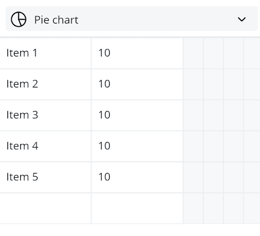
- To add charts to your infographic click “More” from the menu on the left of your screen. This will open up a few other menu options and you can choose “Charts”. This will open up a menu for charts. Select the type of chart you want to include.
- The values within your graph can be changed by typing in the amount you want for each section. You can also change the label for each section by typing it in where it says “Item”. Be sure the labels match up with the correct amount.
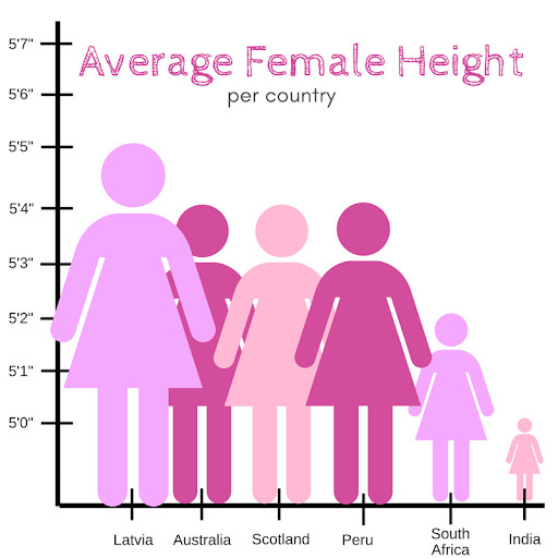
Data is not always represented in an unbiased way or in a manner that doesn’t lead to misinformation. For example the graph below makes the average height of women from Latvia look much larger than the average height of women from India even though there is only a five inch difference. Be sure to represent your data in a way that does mislead the reader.
Conclusion
Have everyone display their infographic on their computer so the class can do a gallery walk. Alternatively the infographics can be shared with each student so they can examine them on their own device. A scavenger hunt can be created where each student has to answer a question about each topic covered. Have each student provide a question for their peers to answer based on information found in their infographic. Give students the opportunity to go around and read each infographic and try to complete the scavenger hunt. Guidance for the questions students need to answer can be provided by the instructor to reach your goals for the lesson. Encourage students to focus on critical literacy and analytical skills.
If students want to learn more about graphic design and different visual aspects behind infographics they can check out Pinnguaq’s lesson Introduction to Graphic Design.
Resources
- Smore is a site for creating newsletters that provides statistics on your newsletters. It also has an article explaining infographics and provides excellent tips.
- PwC (PricewaterhouseCoopers) is a business site that looks at new ways of keeping a competitive advantage. Their article, “When and how to create an effective infographic”explains what makes an effective infographic and when it is appropriate to use infographics.
- Easelly is an infographic maker website with a blog post about incorporating infographics into any subject area.
- Hubspot is a company that specializes in marketing and sales software for attracting new customers. They have a blog post about the basic elements of graphic design. These elements should be considered when designing advertisements and infographics.
- Plain Language has an article that briefly explains how to write for your audience.
You might also like

Comic Book Storytelling Using 7 Grandfather Teachings
 Grade 3 – Grade 5
Art and storytelling is very important in Indigenous culture. In this lesson we combine the Seven Grandfather Teachings with digital comic book strips.

Introduction To App Lab
Grade 9 – Grade 12
Using App Lab students will learn the basics of developing an app and the basics of programming using App Lab and code.org.

Creating Positive User Experiences When Introducing Players To Your Game
Grade 11 – Grade 12
How can you create a positive user experience for players when introducing them to your game? It is more complicated than you think! Find out more in this lesson.
