Section Navigation

Introduction
Almost everything not created by nature has been, in some part, “designed.” From three-dimensional objects and products such as cars, buildings, soda bottles, and computers, to two-dimensional objects such as a movie poster, magazine advertisement or website. Designers create logos and the box for your favourite video game.
For two-dimensional objects, this is called Graphic Design.
Though graphic design originated with physical tools: coloured markers, pens, rulers and paper, designers are increasingly working digitally, using a variety of powerful, design-driven software.
Learning Goals
In this module students are introduced to basic terminology and principles of graphic design. Topics include colour combinations using the colour wheel, balance, alignment, and focus. The module involves critical thinking and examination about their personal design preferences, as they relate to graphic design topics. Students will apply their understanding of the topics presented through the creation of a brief and creative design project.
Curriculum Links
This module provides an opportunity to address curriculum expectations in the Arts in Grade 6. In particular, students will address using graphic design to communicate and develop critical thinking and decision making skills.
Vocabulary
Layout - How elements of a design, such as text and images, are arranged.
Balance - Refers to how “even” a design appears in terms of its visual weight; that one side of the design does not seem considerably heavier than the other.
Alignment - The way visual elements are arranged so that they line up in some way.
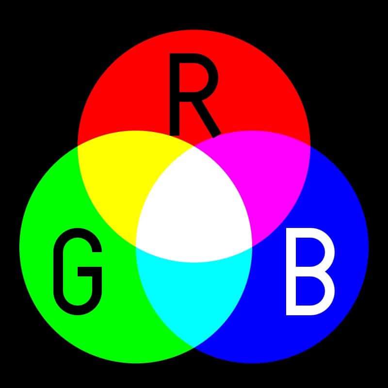
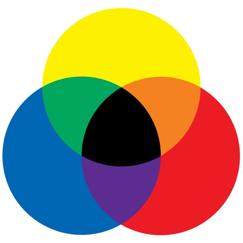
RGB - Stands for Red, Green, and Blue, and is the acronym for the primary colours in an additive (light-based) colour system where full values of all three mix to create white (as opposed to the subtractive primary colours red, yellow, and blue, where all three mix to create black).
Background Information
A graphic designer considers different tools and techniques called principles, or “rules”, of design. These “rules” govern the ways various elements are arranged or composed within a two-dimensional space. Though “rules” is a strong word, you will see examples where the rules were not followed, but broken – however you have to know and understand the rules before you can break them effectively and intentionally. Furthermore, learning the rules of design gives new designers a solid base from which they can create. There are many graphic design rules, and many overlap as they are interrelated.
The following are some of the key topics that frame graphic design:
Colour
Colour, unsurprisingly, is a very important part of design. It is often the first thing people notice and can set the mood and evoke memories and emotional responses. Think about these questions:
What is the first colour you think of when you imagine:
- a tree in the summertime?
- a crow?
- a rainy day?
- a rose?
Designers use colours intentionally, to evoke meaning, and to add beauty to their work. They use colour tools to select the most appropriate colour combinations.
The colour wheel shows relationships between colours.
For additional guiding imagery to the following points, see the supplementary presentation.
Primary Colours
The primary colours of light (screen-based) are Red, Green, and Blue (RGB). All colours can be made from these three colours. RGB values describe how much of each colour is made up from R(ed), G(reen) and B(lue). They range from 0 (least) to 255 (most) where R=0, G=0, B=0 is black, and R=255, G=255, B=255 is white
For students with access to GIMP or another image or graphics editing program, have them open the program and experiment with values to see how different colours are produced.
Colour Schemes/Colour Combinations
Designers use the colour wheel to help them come up with different colour schemes that are visually pleasing and appropriate for their project. The following are the most common colour schemes:
- Complimentary – A complementary colour combination uses two colours that are opposite each other on the colour wheel.
- Analogous – An analogous colour scheme uses two or more colours that are adjacent on the colour wheel.
- Triadic – A triadic colour scheme uses an equilateral (equal-sided) triangle to pick three colours evenly spaced around the colour wheel.
Now look at the included Cereal Box examples as a group and try to point out which type of colour scheme the designer used for them.
Contrast and Readability
As design projects are generally created to give information to a viewer, designers have to be careful about which colour combinations they use to ensure the information they present is clearly visible and easy to read. Some colours may create a harmonious colour scheme, but not be clear enough when using text and colour blocks together. To ensure your designs are readable, ask people who have never seen your design to give you feedback, stand back from your computer screen and see if it is still readable from a distance, or print it out in black and white to see if there is enough contrast.
Topics on Layout
Designers often have multiple elements they need to include in their projects. Titles, paragraphs, photos, logos and other information have to be organized to achieve the desired effect. The way these elements are combined is called the layout. The layout of a project is informed by a number of design principles such as balance, alignment, and hierarchy.
Balance
In graphic design, balance refers to how a design is visually weighted, and that one side of the design does not seem considerably heavier than the other. A balanced design feels harmonious, and that all elements are combined in a compelling or meaningful way. There are four main kinds of visual balance:Symmetrical Balance – Symmetrical balance is when two sides of a composition are very similar, creating a feeling of equal balance. This type of balance is considered formal and in some cases uninteresting and boring, but used very often. For example, when all the elements on a page are centered, leaving equal space on both sides.Asymmetrical Balance – Asymmetrical balance is considered more interesting for compositions. Instead of using identical elements to balance their work, designers use different elements that together become balanced. For example, an image can use one large image, paired with a number of smaller images that help balance it. Different colours also work to help balance images. Darker images tend to have more “weight”, while softer images feel “lighter.”Radial Balance – In this type of balance, elements are arranged from a single common center point. There are many examples of radial balance in nature, such as the petals of a flower of the arms of a starfish. Radial balance can also come from compositions that are a spiral rather than a circle.Crystallographic Balance – Also called mosaic or “all-over” balance, and refers to situations where many objects of equal weight or size are repeated. Through the repetition—which at first glance may seem chaotic—the emphasis or balance is uniform.
Alignment
Alignment is making sure the pieces of your design are lined up properly for the desired effect and ensures things look in “place”. Grids and rulers help to ensure elements are aligned. When things are not aligned properly the design may feel messy and not “harmonious.”Using Grids and Rulers – Grids and rulers can help you align elements in interesting ways. Many graphics programs have a “snap” feature that causes elements to “jump” automatically to a specific position when it is dragged near a desired alignment point Breathing Room/White Space – Designers consider leaving space around elements and grouping ones that should go together. For example, leaving room around the margins of your project can make it nicer to look at and easier to read than putting things right along the very edges which can make it feel crowded and unbalanced. Overloading a design makes it difficult for viewers’ eyes, and makes an unsuccessful design. Less is often best.
Hierarchy/Focal Points
When designing a project, it is important to know what the “focal points” are. What are the most important elements of your design? It may be tempting to make all elements big, or loud, but that creates a design where not a single element stands out. Viewers don’t know what’s important or what to focus on, because everything has the same “weight.”
Knowing what the most important message is helps create a “hierarchy” of information. Think of your information in terms of a “Top 10” list, making sure that the top entries get the most prominence in your design.
Bringing it all together in the layout
A layout is how all the design elements are laid out or organized into one connected piece. There are many questions that need to be asked when creating a design. Collect all the pieces you need then ask yourself some questions:
- How important is this title?
- How important are these images?
- How important is this block or these lines of text?
- How can I organize all this content so it looks neat and balanced?
- Am I using colours in a way that speaks to the spirit of my design? Are there specific colours I must use to adhere to a company brand?
- Are all the elements readable? Can people easily understand what I am trying to say?
- Is there an appropriate amount of room dedicated to each element?
- What is the “desired effect” of my design? What am I trying to say?
For example
Perhaps the design is for a gathering at a community center. The design should probably have a strong eye-catching title so people know what the event is about. Dates and times are very important to show clearly. An eye-catching image that conveys the spirit of the gathering would be appropriate. Colours may have to be taken from a logo or the colours of the community centre so that it looks appropriate for the event you are promoting.
Additive (RGB):
Subtractive (RYB):
Non-Computer Activity
Generate a group discussion by asking the following questions:
- What is your favourite movie or event poster, advertisement, or album cover?
- What about them interests you? Why do you like it?
The intention is to get the students thinking critically and talking about colour, images, points of focus, logos, the organization of elements – anything that references the visual design.
An example for discussion: The Lego Movie poster included can be reviewed at this point. Point out the symmetrical design, the use of colours and sharp lighting against a dark background for visual interest, and the hierarchy of the layout. Which elements take up the most of the poster and why? You can even point out that the main character Emmett’s outfit is a complementary combination of orange and blue.
Computer Activity
Create a movie poster, event poster or music album cover.
Using GIMP or another graphic program, create a layout for a movie poster, event poster or music album cover, taking into consideration the topics and design principles covered in this module.
Consider all aspects that should be included in your design before going on the computer. Create a few quick sketches on paper to work through a few ideas. Adding an important piece of information after completing your design is much more difficult than considering it ahead of time.
Take some time to look through all the information and visualize which elements should be given the most space and emphasis compared others that could have less prominence in the layout.
Conclusion
Give yourself time to experiment with the design principles to see how you can use them to create different effects. There are many more design rules and guidelines that you can research to help you create stronger designs.
Take inspiration and ideas from the world around you. Look at other designers’ work you find interesting or attractive and see if you can determine the rules or guidelines they used to create their work.
An important thing to remember is that design is not just about one piece or part, but the combination of all the elements and how they work together.
Resources
Additional Resources
- Jensen Group – Canadian Indigenous Graphic Design House
- X-ing Design – Canadian Indigenous Graphic Design House
- A Book on Graphic Design for Kids by Chip Kidd
- CBC Podcast Series on The Power of Colour
Social Media Resources
- Luke Wroblewski • Designer – includes some great insights into UX and UI design as well
- Chip Kidd • Designer – author of GO: A Kids Guide to Graphic Design
References
Below are the links/sources for images used in the supplementary presentation. Note that cereal boxes are not CC0. All other images are CC0.
- Colour Wheel by László Németh
- Grapes
- Pansy
- Waxy Tree
- Banana Tree
- Bird
- Mandala
- Stop Sign
- Kix
- Apple Jacks
- Rice Krispies
- Reese Puffs Cereal
You might also like

Introduction To App Lab
 Grade 9 – Grade 12
Using App Lab students will learn the basics of developing an app and the basics of programming using App Lab and code.org.
Pixel Art 1: Getting Started With GraphicsGale
Grade 9 – Grade 12
In this module students will create a pixel art sprite with physical media and then transfer that image into a freeware program called GraphicsGale to make a useable PNG image file.
Creating Infographics
Grade 7 – Grade 12
In this lesson teachers will choose a topic that students will have to create an infographic about using Piktochart!
